
Brand book
Everything you need to make something that looks and sounds like Kilndar: the mark, the colours, the type, the drawings, Bea and Ver, and the way we write.
Essence
Kilndar runs a craft studio's whole day: bookings, front desk, till, kiln, pieces and rota, in one system.
The whole day
Kiln loads, piece tracking, collections, the floor plan, the till, table ordering, rotas and the daily brief run inside, next to the bookings.
Vertical first
Words and modules follow the studio's craft, so a candle, glass or yoga studio never reads pottery vocabulary.
Radically honest
Every public claim is a shipped fact, every screenshot is the running product, and anything unfinished is labelled.
Built by an operator
Every feature comes from a real need on a real studio floor, not from an office roadmap.
The counter is busy. The software is not. One glance, one tap.
Short sentences and the words studio staff already use. No hype.
Software for people who make things with their hands, and it shows.
Logo
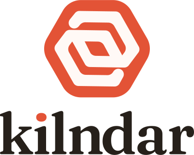
The hexagonal kiln swirl: a kiln seen from above, the heat turning inside it. It comes in three lockups. Use the files, never redraw it.
Clear space
Keep a quarter of the symbol's height clear on every side. Nothing else enters that frame: no text, no edge, no other logo.
x = symbol height ÷ 4
Minimum size
Below these sizes the swirl closes up. Shown here at real size.
In print: the horizontal lockup never below 25 mm wide.
The logo's own colours
The mark carries its own cream and ink, set in the source files: hexagon #E35336, swirl #FFF9F6, wordmark #26201A, dot on the i #E35336. Interface text uses ink #1A1714. Do not "correct" one to the other.
Never
Colour
A neutral grey and white field carrying two saturated blocks. Colour has two jobs and they never swap: ink selects, vermilion asks.
Status
Status reports a state. It never asks and never selects. States show as tint plus text shade; the solid is for dots, icons and the delete button.
Selected states are always ink. A request for action is always vermilion. Never a vermilion "selected" state.
At most two solid colour blocks per screen: one vermilion, one ink. Everything else is white or grey.
White text never sits on vermilion at body size. Blocks take ink text; buttons take the deeper primary action fill.
Salmon is an accent on ink fills only. On white it is unreadable and becomes a second brand colour.
| Pair | Sample | Contrast | Use |
|---|---|---|---|
| Ink on white | Aa | 17.85 AA | All text |
| Ink on ground | Aa | 15.50 AA | Titles and text on the page |
| Text grey on white | Aa | 7.25 AA | Secondary copy, captions |
| Text grey on ground | Aa | 6.29 AA | Captions on the page |
| White on primary action | Aa | 4.74 AA | Primary buttons |
| Ink on vermilion | Aa | 4.72 AA | Text on vermilion blocks |
| White on vermilion | Aa | 3.78 Large text only | Large display only, never body |
| Salmon on ink | Aa | 7.30 AA | Accents on ink blocks |
| Vermilion deep on tint | Aa | 4.80 AA | Small vermilion text |
| White on ink | Aa | 17.85 AA | Text on ink blocks |
Contrast computed with the WCAG 2 formula. AA needs 4.5 to 1 for body text and 3 to 1 for large text (24 px, or 19 px bold).
Type
Two faces, nothing else. Parkinsans, rounded and friendly, for titles and big figures. Funnel Sans for everything you read or click. Contrast comes from size and weight, never from a third family.
Parkinsans
Semibold 600, bold 700, extra bold 800. Tight tracking, tabular figures.
Run your studio's kiln.
Funnel Sans
Regular 400, medium 500, semibold 600, bold 700. Plain and operational.
Twelve guests booked for the 2 pm wheel class. Two pieces are ready to collect, and the next kiln load fires on Thursday.
Headings, labels, buttons and badges. No tracked uppercase labels anywhere.
A heading carries at most one coloured phrase: vermilion on white, salmon on ink. Never italic.
The em dash is banned in every piece of copy. Use a full stop or a comma.
Illustration
Drawn characters, real clay things.
Bea and Ver live on paper: a thin ink line, no colour. The things they hold are soft 3D clay in full colour, the same family as the feature icons. The product interface keeps to Lucide.

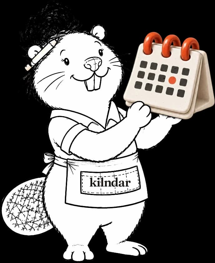
Interface icons are Lucide: 2 px stroke, ink, on white circles or plain.
Bea and Ver are always a thin ink line, no colour. Never rendered in 3D.
Kilns, calendars, card readers and every feature icon are soft 3D clay, in vermilion, ink and off-white.
When a clay object meets the drawn paper, it gets a loose pencil shadow, so it sits in the drawing instead of floating on it.
Lucide icons
The product interface only. 2 px stroke, ink, on white circles or plain.


Clay objects
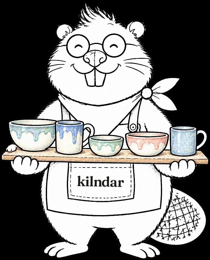
Feature icons, empty states and anything a character holds. Soft 3D ceramic, always on a white tile when it stands alone.
Bea and Ver
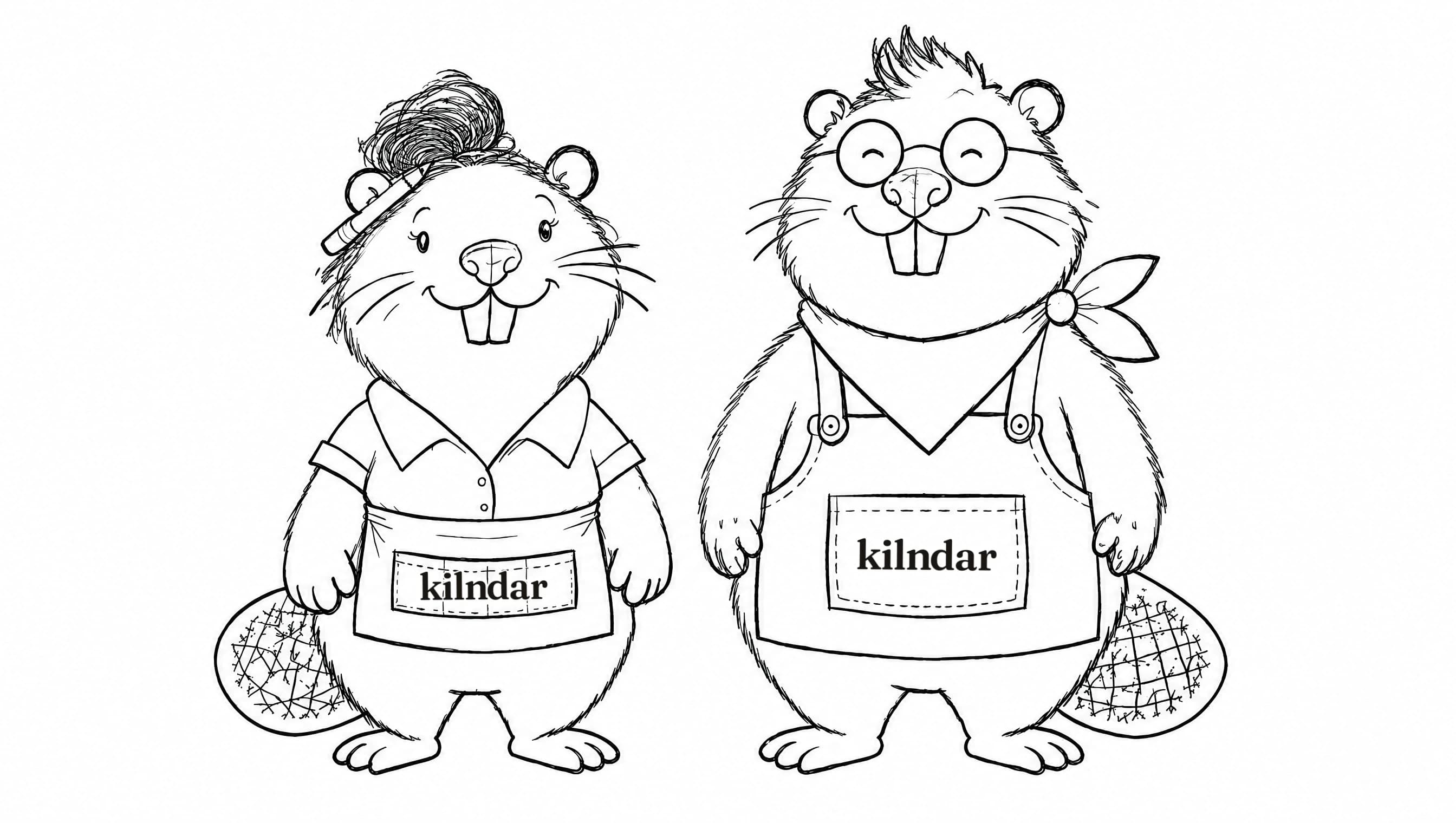
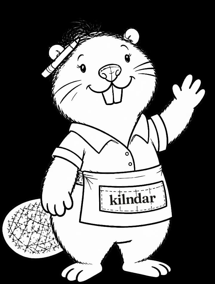
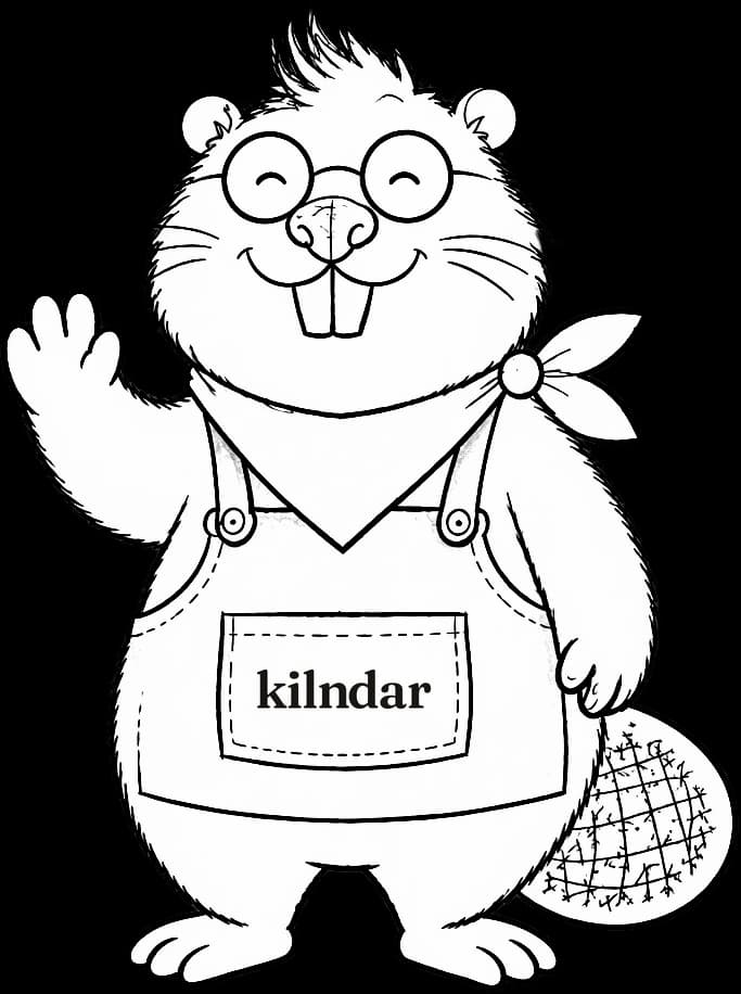
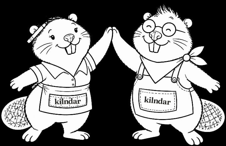
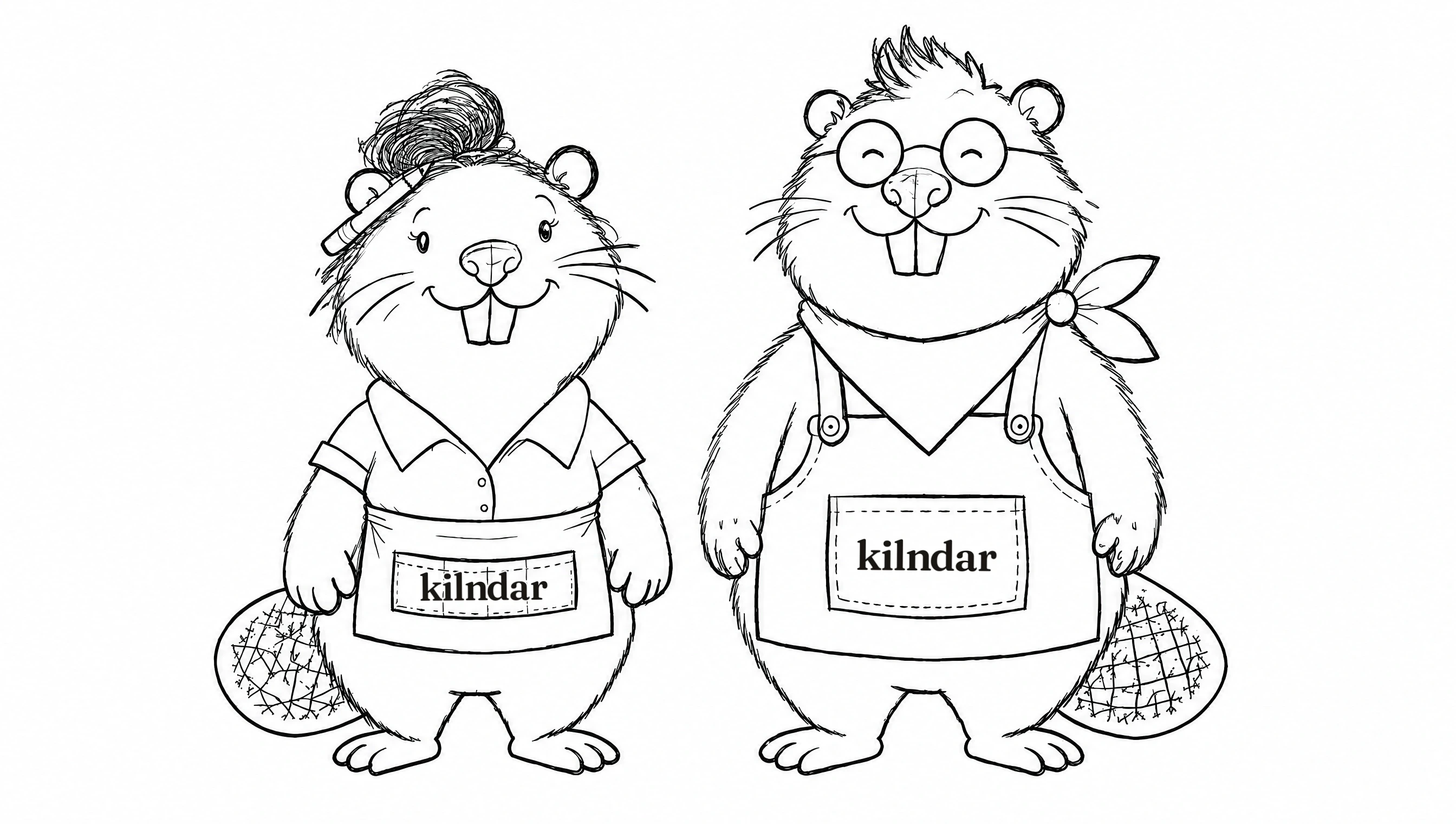
A beaver couple who run their own studio. They tried the spreadsheets, the sticky notes and the five separate apps, then moved the whole day into Kilndar. Say their names together: Bea and Ver, beaver.

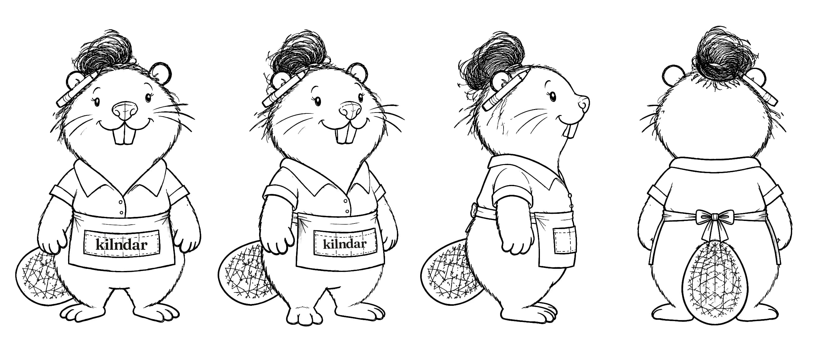
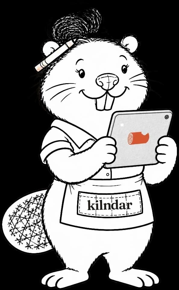
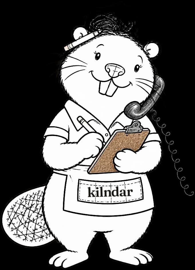
Beatriz, "Bea"
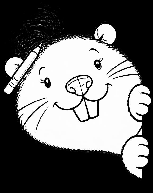
Runs the counter and the business: bookings, customers, the till and the team.
Short and chunky, with an ink-black messy bun, a pencil behind her ear, a short-sleeved shirt and a waist apron with kilndar on the pocket.

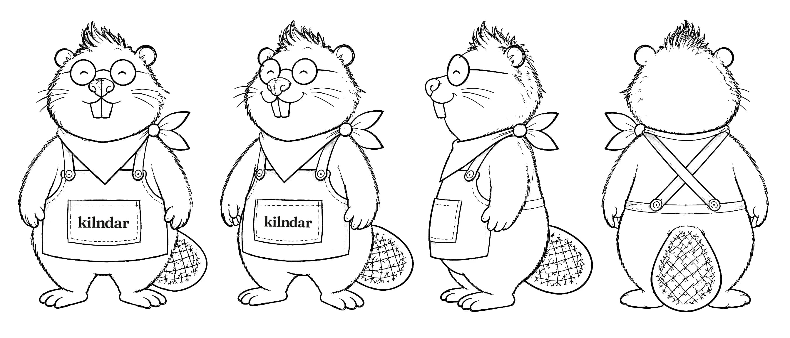
Vernon, "Ver"
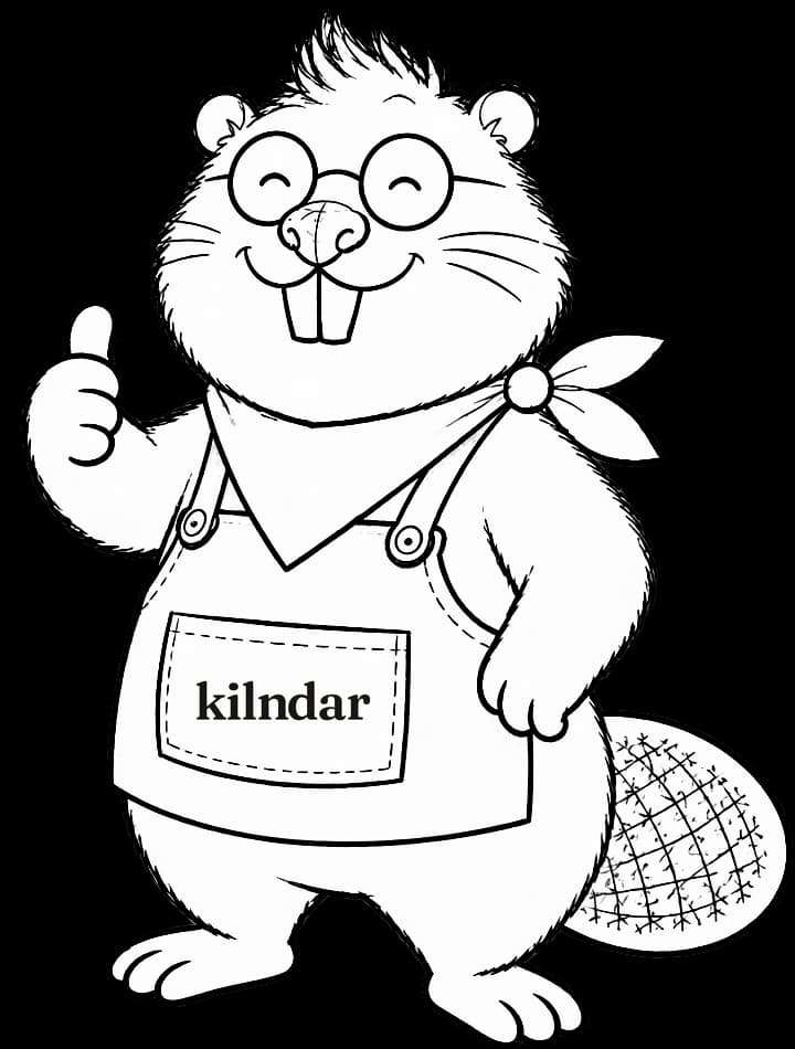
Runs the workshop: the kiln, the pieces, production and collections.
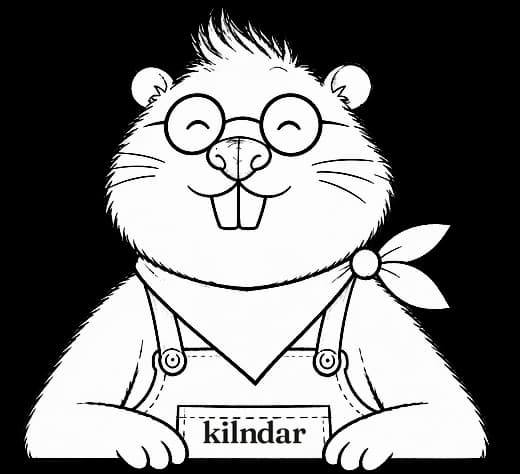
A head taller and rounder, with a dark tuft, round glasses, a calm closed-eye smile, a bandana and a bib apron with kilndar on the pocket.
Pose library
Sixteen poses drawn from the approved model sheets, transparent, ready to place. Each one has a job.






Do
- Let the one who lives the problem speak: Bea for the counter, Ver for the workshop.
- Use them on social, in stories on the website and in the occasional dashboard tip: a small head and one line.
- Keep them line only: no colour on the characters. The clay things they hold keep theirs.
- Print the real kilndar wordmark on a visible apron pocket, never drawn or generated lettering: ink on a white pocket, white on a dark apron.
- Keep the thin line and leave most of the shapes as white paper.
- Draw new poses from the approved model sheets only.
Don't
- Present them as real customers, or give them a testimonial, a figure or a result.
- Put them next to a real studio or customer.
- Show them on service screens: front desk, till, kiosk, QR scan.
- Colour them in, change their clothes or proportions, or redraw them in another style.
Voice
We write the way a good studio manager talks at the counter: short, specific and kind. UK English (colour, centre, organise), sentence case, real words.
Only what the product does today. Anything not shipped is labelled. No invented numbers, testimonials, customer logos or press.
Say booking, session, kiln load, ready to collect. Not "resource", "slot inventory" or "workflow".
Studios that use Kilndar appear only as their logo, shown with their permission. We never quote them or put numbers in their mouth.
In use
Four places the brand shows up, built from the real tokens. Tips and headlines describe what the product does today.
Bea runs the counter. Ver runs the kiln. Kilndar runs the day.
Taking a booking over the phone? It goes through with the waiver pending, and the customer accepts it on the payment link.
Your studio is ready
Sign in to add your first activity and open bookings.
Sent by Kilndar
Run your studio's kiln.
Bookings, front desk, till, kiln and rota in one system.
Applications
Merch, print and events. One lockup per object, placed from the files. When the object is small, the symbol goes alone. On dark fabric the wordmark turns cream.
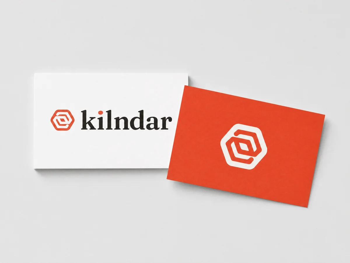
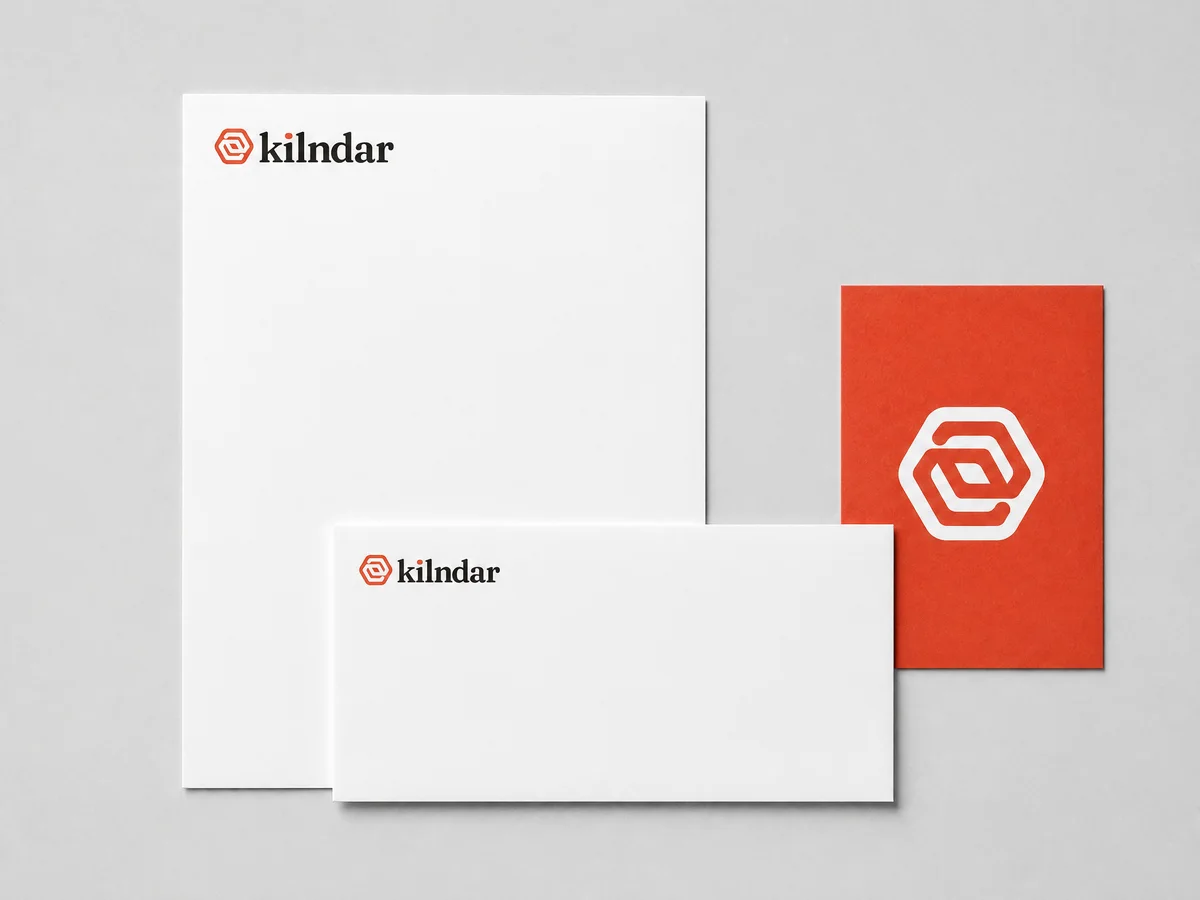
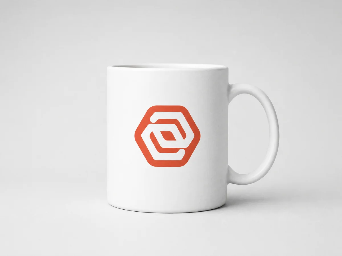
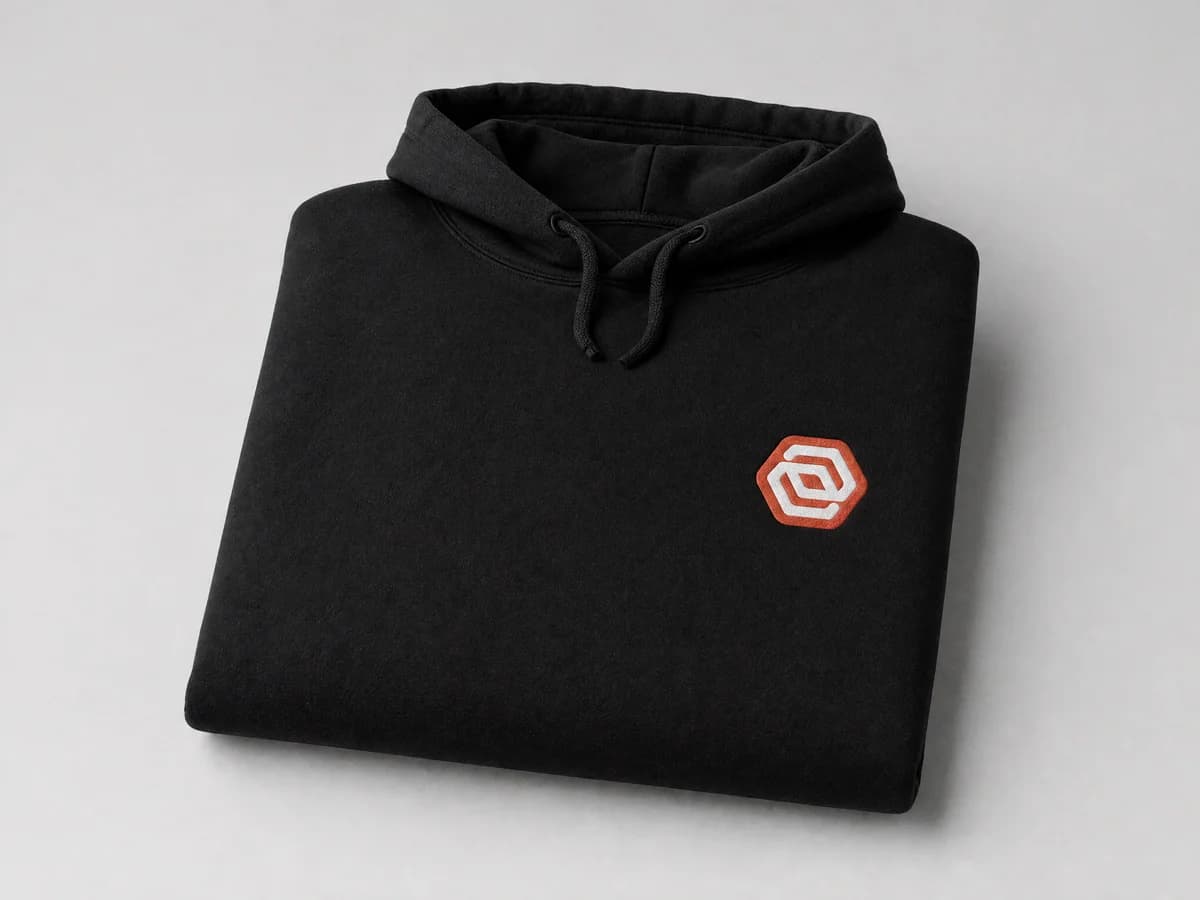
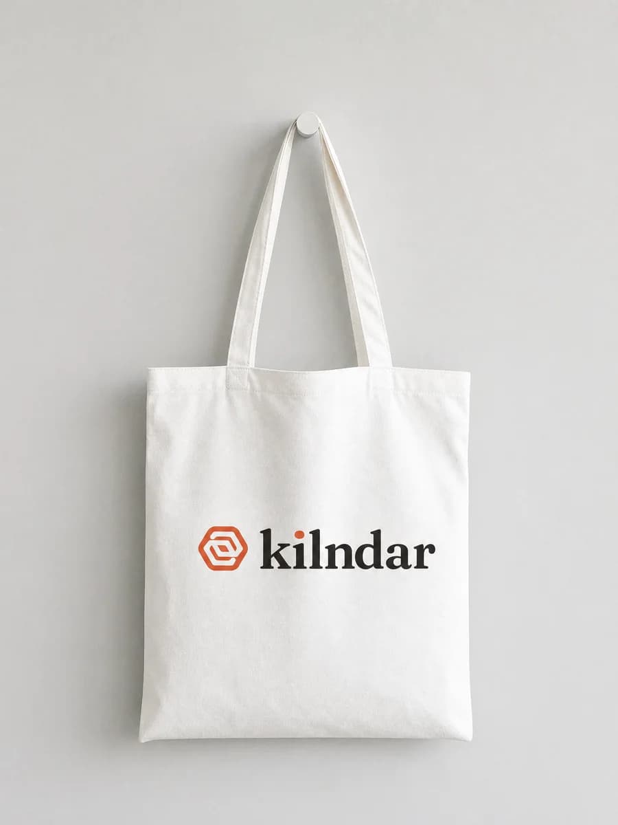
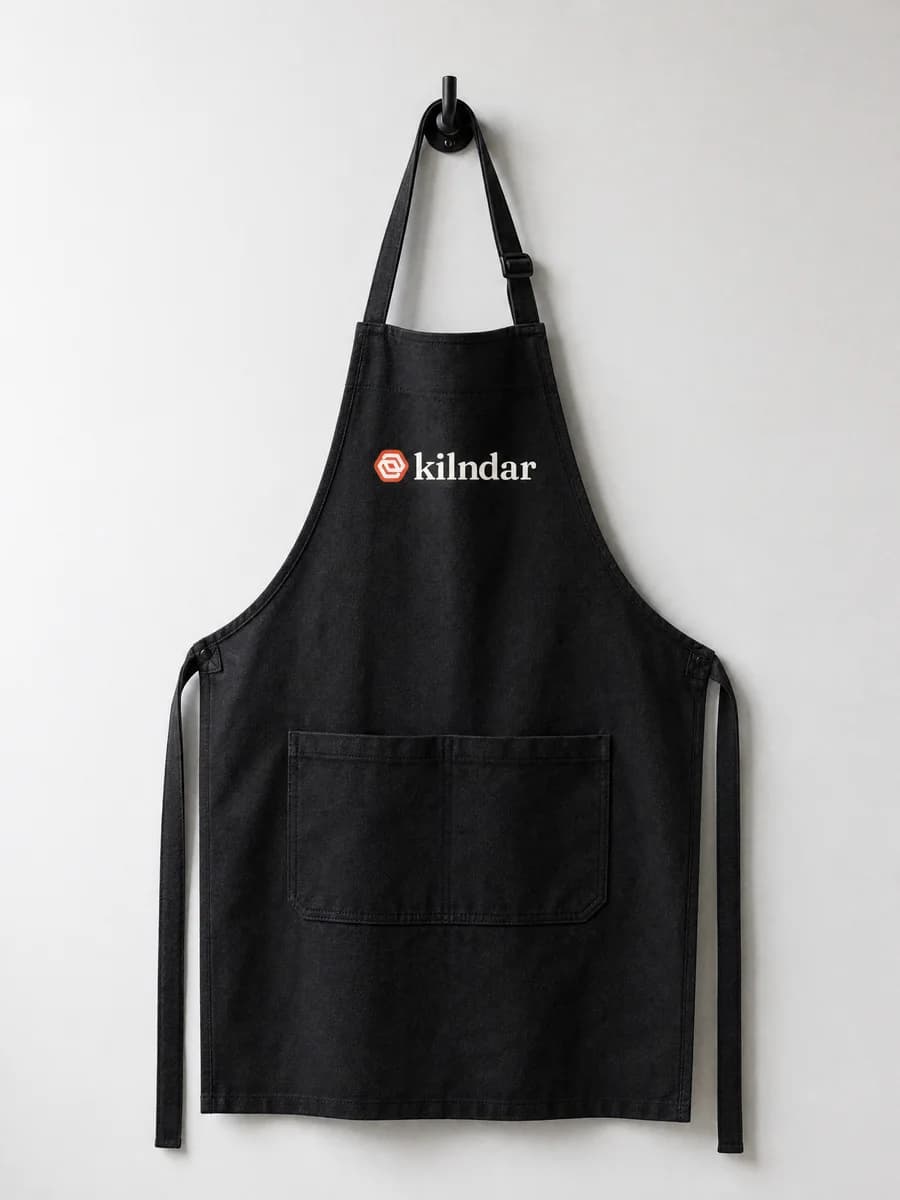
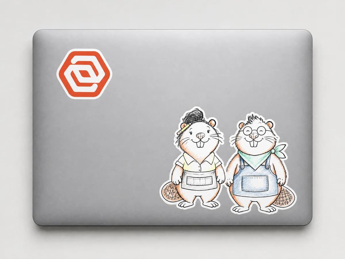
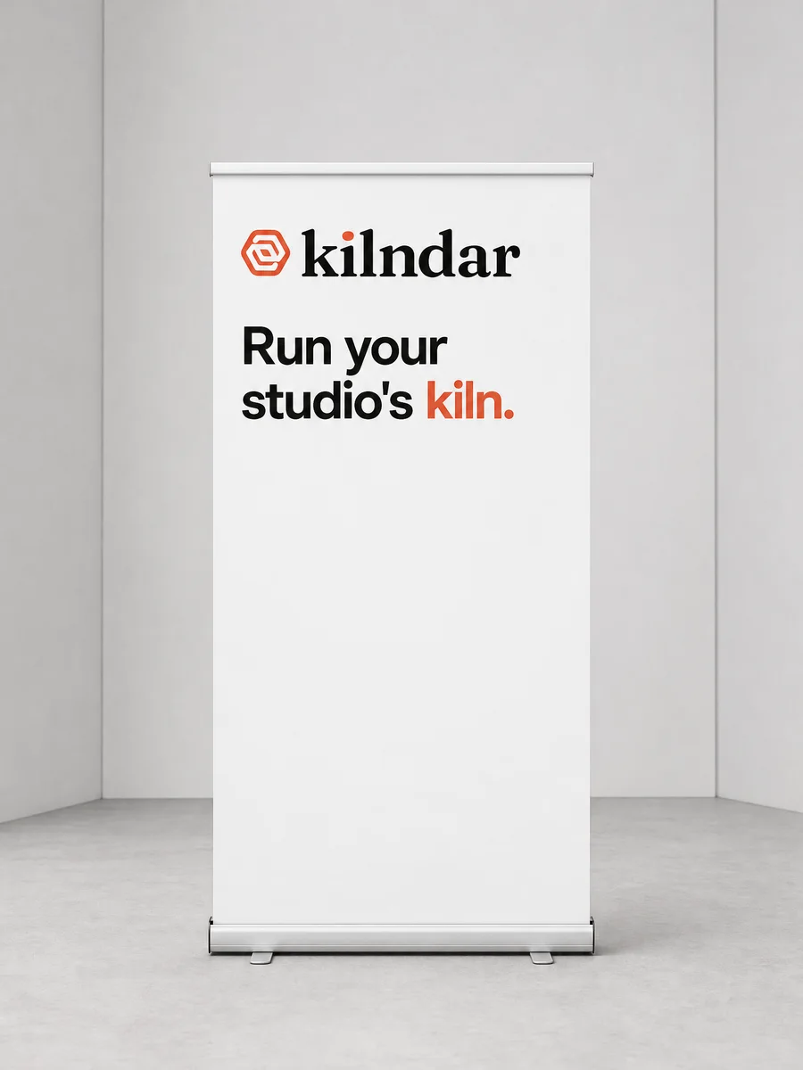
These are generated previews that show placement and colour, not photographs of products that exist yet.
Files
PNG for documents, slides and social. SVG for print, signage and anything that has to scale. On a dark ground, take the on-dark version.









Kilndar brand book · Version 1 · 2 November 2026